Don’t Call it Accessibility
Myths and misconceptions in the design of accessible digital products.
It is undeniable that in recent years the web scene has shown a renewed interest in the topic of accessibility. In addition to the major players, such as Google, Apple, Facebook, etc., whose products have always offered good accessibility, today various stakeholders are showing new levels of sensitivity towards this issue and towards the WCAG (Web Content Accessibility Guidelines).
In response to demand in this area, we decided to start studying the issue in depth, rather than simply sticking to the usual technological best practices. We analysed the WCAG, and related them with:
- customer requests
- implementations of the guidelines on the so-called ‘accessible templates’ (an example can be found here)
- scientific studies and publications.
We derived various thoughts and a methodological approach that enabled us to deal with the issue of accessibility by degrees. With a broader, project-wide vision we were able to implement solutions that bring real value to the product in terms of accessibility, rather than simply obtaining a given certification (so-called ‘badges’) by passing automated tests.
1. Setting out from the definitions
In approaching the issue of accessibility methodically, we decided to start from the very definition of the word. We quote (Italian) Wikipedia, which offers a simple but exhaustive definition:
Accessibility is the characteristic of a device, a service, a resource or an environment to be easily enjoyed by any type of user.
This definition does not refer specifically to Web accessibility, but it is nonetheless effective for our ends. Going into more detail, we analysed the four principles that embrace the all of the WCAG rules, summing them up as follows:
- Perceivable: the content must be easily distinguishable by all categories of users, without tangible sources of error
- Navigable: the content must be easy to reach for all categories of users, without the risk of getting stuck and/or lost while exploring the page
- Comprehensible: once the content has been ‘reached’, it must be comprehensible, without risk of misinterpretation, for all categories of users
- Compatible: the content must be usable by all categories of users, regardless of the assistive technology they use, both currently and in the future.

From a simple initial reading of these principles, a first, very common error emerges: accessibility of web page content does not simply mean offering tools to alter its appearance, and actually requires much more extensive work.
There is also widespread confusion regarding the distinction between accessibility and legibility. Legibility indicates the ease with which a user can understand a block of text. In the WCAG, it is included within the concept of accessibility (see WCAG, pgph 1.4.8 and pgph 3.1) but the two concepts can actually be considered as complementary, and are both fundamental to the enjoyment of content.
2. ‘Let’s be clear’
The reason why a user accesses a page is in order to enjoy its content. Its content, or rather the information the user gains from it, is to be considered the most important aspect of the page, of interest both to the client and to the end user.
It is essential that anyone, regardless of any temporary or permanent disabilities, can gain the same information from the content of the page.
Technically, the comprehensibility of the content of a block of text is known as “readability”:
- Readability: comprehensibility in terms of content
- Legibility: comprehensibility in terms of form.
Regardless of the tools available, one fundamental principle should be remembered:
Readability should always be defined in relation to a target audience.
It indicates the extent to which the text can be understood by a specific target readership, with reference to the complexity of the language used.
There are two possible approaches to this aspect: the first is to produce high-readability content, which can be understood equally well by a wide range of users — in this case we are working with a minimal target level, i.e., users with a low level of education. Otherwise, if we prefer to maintain the originality of the content (e.g., for content of a scientific nature), the approach would be to show alternative content — which sums up the original concepts using language that most people can understand. Once we have chosen our approach, the right editorial team should be chosen to take care of producing the texts.
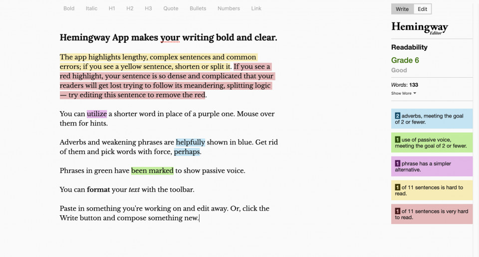
There are a number of best practices applicable to each target (using short sentences, avoiding the passive voice, avoiding the excessive use of adverbs, etc.), but these should be taken as suggestions to be weighed up according to each circumstance, rather than applied as inviolable rules.
Furthermore, there are many tools available on the web that will analyse text readability automatically, although many are outdated and/or have to be paid for.

As with all automatic tools, they do not guarantee achievement of this objective, but simply offer an extra check:
- Link to readability tool (Italian language)
- Link to readability tool (English language)
- Link to other references for readability (English language).
3. A̶c̶c̶e̶s̶s̶i̶b̶i̶l̶i̶t̶y̶ Legibility panel
Legibility is a concept often confused with accessibility. On the web you can find innumerable different panels containing tools to alter the appearance of a web page. These panels are erroneously called ‘accessibility panels’, when they actually contain tools to improve legibility — when used judiciously.
Changing font, colour and dimensions of your text or highlighting links to other pages are tools that at best will improve text legibility, and should be carefully considered before being proposed as tools for the user: there is a danger of offering too many options, which often end up being detrimental to legibility..
We suggest that you only follow best practices derived from scientific studies, and carefully analyse each tool using manual tests (not only automatic ones) before offering them to your users.
Examples of best practices with relevant studies include (see bibliography at the end of the article):
- Avoid characters that are unusual-looking, that might distract from the content, or that have not been tested objectively (Simon 1945, Hartley 1994, Black 1990, Luna 1992)
- Use serif characters for prose and for the body of a text (McLean 1980)
- A good method for calculating line length is to type the lower-case alphabet of the chosen character and measure the length obtained, then multiply it by a factor of between 1.5 and 2 (studies cited in https://en.wikipedia.org/wiki/Line_length)
- The number of keystrokes per column will vary according to the justification, body and design of the character. In order to reduce corrective saccades between the one line and the next, it is advisable to stay close to the following ranges: 80–90 keystrokes maximum, 60–70 keystrokes optimal, 40–50 keystrokes minimum (Chialab study)
- Avoid justified text: horizontal spaces disturb reading flow (Carter 1993).
Finally, regarding the choice of font, it has been proven that the so-called “high-legibility fonts” do not tangibly help reading, whereas use of the correct spacing between words can lead to greater legibility. Hence it is not the character that determines the best reading performance, but its composition (see Print readability and dyslexia).
Legibility panels remain an important tool to be offered to users in order to make web page content customizable to suit individual requirements, with one fundamental proviso: each tool proposed must serve to meet a real need.
4. Accessibility Badge
The renewed sensitivity regarding accessibility has at times led to considerable haste in achieving certain objectives, often seeking to apply solutions to finished projects. Making a website accessible when it was not originally designed to be so can prove a lot of hard work.
This often leads to a rather superficial approach, with the aim of achieving minimal objectives, such as the much sought-after ‘badges’ certifying the ‘accessibility’ of digital products. These certificates are issued by a number of different agencies, and unfortunately, they have little to do with the production of truly accessible products: it is almost always a matter of achieving a basic standard, generally in the form of a report attained by passing a number of automatic tests.
All the automatic tools already mentioned above are freely available online, and serve to check that standard web accessibility rules have been met on the pages submitted. As the tools themselves often emphasise on their own presentation pages, they represent a first step in assessing a website as potentially accessible. This makes them very useful, as they make it easy to detect and solve problems in a targeted way.
However, many stakeholders consider the reports issued by these tools and the various agency ‘badges’ as a definitive result in considering their product ‘accessible’. The problem is that neither automatic tests results nor the attainment of any badges are a guarantee that the product is truly accessible.
Each aspect of accessibility needs to be manually tested by professionals, ideally people belonging to the categories of users in question. This is the only way to get an idea of the effectiveness of the measures taken.
It is not possible to declare a website accessible, by definition, if the content has not been successfully enjoyed by all categories of users.
Conclusion
The values and concepts covered in the points above are fundamental principles in making a digital product accessible, and they should be the object of training for stakeholders involved in the workflow.
In general, for each aspect of accessibility, we recommend the following flow:
- Start from a definition of the specific concept
- Analyse what the real, specific needs of the users are
- Plan one or more solutions, with reference to scientific studies
- Implement the solution
- Test it, first automatically, then manually with professional users
- Adjust it according to the feedback from the tests
- Repeat the process if necessary.
The creation of an accessible digital product should be approached in the same way as any other project: it entails costs and a great deal of resources. A methodological approach, adopted right from the outset, will make it possible to optimise the benefit-cost ratio, creating only tools and features that are truly helpful to users.
Nicolò Carpignoli
Bibliography
- Black 1990 — Black, A. 1990. Typefaces for desktop publishing: a user guide. London: Architecture Design and Technology Press.
- Carter 1993 — Carter, R., Day, B. and Meggs, P.B. 1993. Typographic design: form and communication (2nd edn). New York: John Wiley & Sons.
- Hartley 1994 — Hartley, J. 1994. Designing instructional text (3rd edn). London: Kogan Page.
- Luna 1992 — Luna, P. 1992. Understanding type for desktop publishing. London: Blueprint.
- McLean 1980 — McLean, R. 1980. The Thames and Hudson manual of typography. London: Thames and Hudson.
- Simon 1945 — Simon, O. 1945. Introduction to typography. London: Faber & Faber.
- Chialab study — https://www.chialab.it/topics/leggibilita-tipografica-e-dislessia.
Our thanks go to Paolo Cuffiani e Andrea Alberti.
